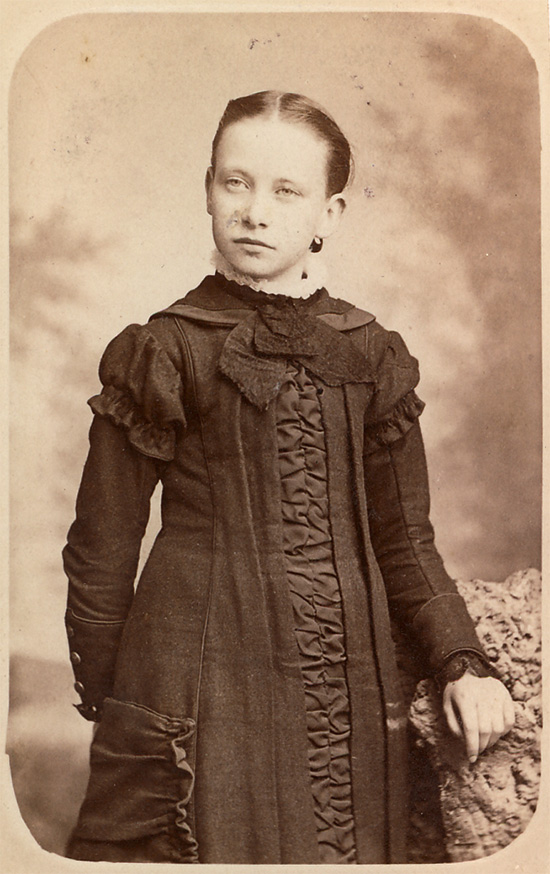
I had no idea what my colleagues were so excited about. While I’d been away on a residency they’d found some new photonerdery to get all tripped out and obsessed on – nothing new on that score! But once I saw the images they were making, well… I had to have a looksee at the process. Just like that, I was hooked, too.
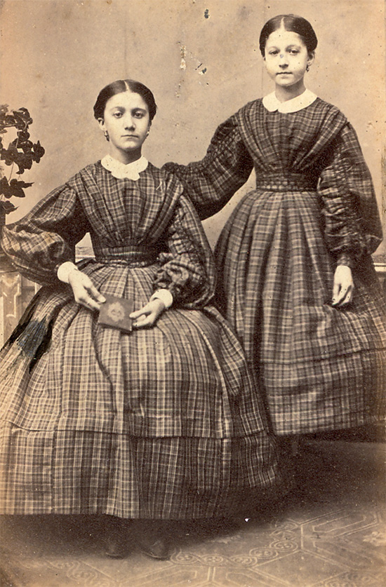
I’m talking about Ambrotypes and Tintypes of course – the fraternal twin sisters of the wet plate collodion process. I’ll spare you the history lesson as other websites have already covered that in much more detail than I’m interested in doing here – but essentially wet plate was one of the first forms of practical photography invented – and was in use all over the world by 1860.
It’s a messy, fussy beast. First you pour a viscous collodion goo all over a piece of glass (to make an ambrotype) or over blackened tin (to make a tintype). The whole plate of glass or tin is then submerged in a bath of silver nitrate. Both the collodion and the silver nitrate are seriously stinky business, and none too good for your longevity, either. The (now light sensitive) plate is then loaded into a darkslide and taken to the camera. It’s important that the photograph is taken while the plate is still wet – then it’s back to the darkroom and under the red lights for the ultra magical magic bit. First the developer makes the image appear in a negative kind of way – pop it into the fixer and the image disappears… and then reappears as a positive. Ooooooooh you say as the image clears. Ooooooooh say all the other people crowded into your darkroom to watch the science. Ooooooooooooooooh.
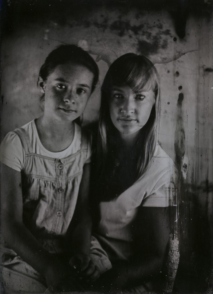
Let’s do another one?! Why not!
There are a few significant differences between ambrotypes and tintypes, and although the process is mostly the same, it’s fussy enough in small and frustrating ways that if you’re thinking about learning the process it’s best to choose a workshop that focuses on the outcome that interests you most. The silver image that forms on the metal or glass is compelling in both cases. Tintypes are one of a kind objects. The image is reversed (words come out backwards), but the object itself is a positive image. Abrotypes can be made on clear or coloured glass. Coloured glass ambrotypes are really very much like tintypes – but a clear glass ambrotype can be used as a negative to make prints or enlargements, or as a positive when placed on a black background. Pretty neat! The best part about this process is the image. Collodion is sensitive to blue and ultra violet light, so when you take someone’s portrait they often don’t look as you’d expect. People with generous amounts of melanin often look bronzed (and quite regal), palefaces like myself can find themselves with freckles on their freckles.
Fast forward to 12+ months after my first experiments with wet plate collodion, and some significant success using it in my own practice. Although I scoffed at the idea when I first heard about other people wanting to do this very same thing – we’re setting up an Old School Portrait Studio at the Lab. Why?! Well, mostly because it’s really fun. We’ve done the science, we’ve got the equipment so let’s share the magic. Awesome.
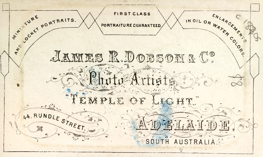
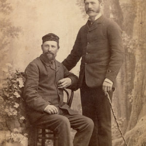
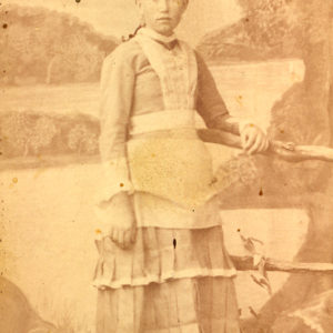
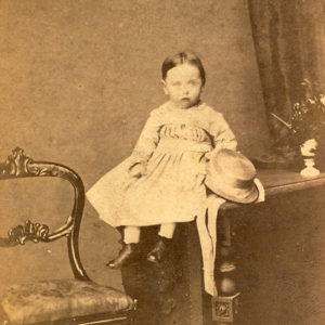
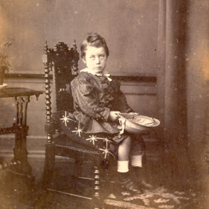
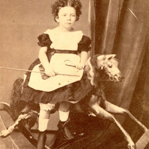
The obvious hurdles of equipment and technique out of the way, now I find myself looking at the problem subset. The same problem that hundreds of portrait photographers found themselves facing back in the late 1800s – wet plate isn’t a very portable process, so how do I make my studio photos look more interesting? For examples I turned to our dear friend Andrew’s collection of Carte De Visite, many of which were made in our home town of Adelaide. I’d always liked looking at these little photos of time past, but when I took a critical look – well – it’s all a bit too amusing not to share. Essentially Old School Photoshop.
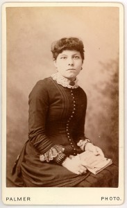
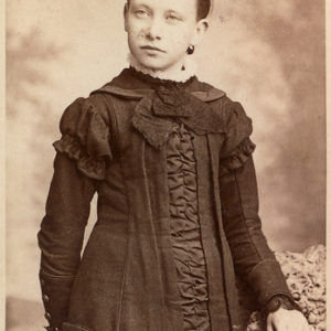
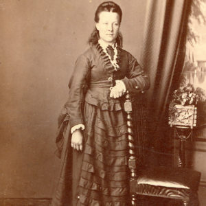
A carte de visite is a slightly larger than business card sized albumen print from a glass negative ambrotype, adhered to a thick piece of card, the back of which usually advertises the photography studio where the image was made. Here’s an example from Andrew’s collection:
Isn’t she amazing! I really dig her buttons.
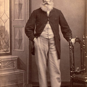
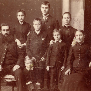
Sitters would have to hold their pose for several seconds to prevent the image from being blurred. This explains why people look so severe in old photographs – just try holding a smile for several seconds – before you can count to three that smile is a grimace. Much better to hold a straight face than to look like some evil villain with a cunning plan. You might also notice that it seems like everyone is a goth. This is another quirk of the process – collodion responds to different textiles in very unusual ways. Wool doesn’t reflect a lot of ultraviolet light, so clothes made from wool usually come out as black – even if they’re yellow! Back in the day all cloth was made from natural fibres like wool and cotton, so unless the person posing was fancy enough to be able to wear silk or satin some other naturally UV reflective fabric their Sunday Best was going to look drab.
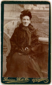
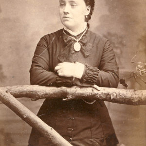
This next carte de visite is my favourite example of ‘Photoshop before Photoshop’. This image was taken by a studio in Edinburgh and yet here our fine matron can be clearly seen in Paris, taking a brief rest to pose for a photo after a long stroll. Yeah, no. Not even a little bit. I suspect this studio could charge quite a bit more because they had such a fancy backdrop, and also proves how long photography has been used to tell creative fiction.
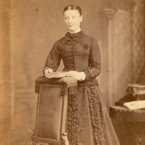
The more of these fine little treasures I looked through I became increasingly intrigued by the fictional settings and small details. (Young ladies sure did like to clutch at books.) Especially because so often the backdrops are hung crookedly, or the photographers have come up with really interesting ways to solve practical problems.
